

If we are going to paint a object, we often need to be able to identify the color of that object at some point. It's not always as straightforward as it sounds, and there are several ways to describe how to identify the color of an object.
Local color is the natural color of an object unmodified by adding reflections, light and shadow, atmosphere, texture, or any other distortion. Local color is considered unknowable by some, due to these other factors being almost always present.
Absolute color (also called objective color) is the color of an object that we would observe by color picking, or visually isolating the colors to remove any influence on our perception from other colors.
Relative color (also called subjective color) refers to how our perception of a color is influenced by other surrounding colors, as well as the context in which we view it. We most often observe colors in relative form, because colors observed in objects are next to each other .
Relative color is the most relevant to painters, since that is how we most commonly encounter color. However, the surrounding other colors can cause misjudgment in color evaluation. Let's take a look the impact that relative color has on our color perception.

In the diagram above, magenta and blue-green are represented by a solitary color box above each of the models, . In the left model, the magenta boxes are all the same, yet we perceive them to be different due to effect of the colors surrounding them. Where there is more blue surrounding the magenta, it appear to take on a blue cast, and where more yellow surrounds the magenta, it appears to have a yellow cast.
A similar effect can be seen on the right box above with the blue-green hue. The same blue-green hues appear to be dissimilar when surrounded by different colors.
This phenomenon is due in part, to the way our visual system averages areas of multiple colors. We blend areas, unconsciously mixing colors next to each other. The term that describes this phenomenon is Optical Blending.
Be aware, that even the white surrounding a color can affect our perception.
Almost daily we observe colors on a small scale on a computer screen or on a printed magazine page.
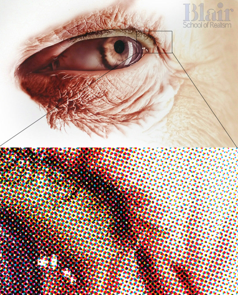
As seen in the magnification of a printed area of my painting above, printed colors usually consist of small dots of 3 different colors (cyan, magenta, yellow) and black, but each of varying size, and all of which we automatically combine to create the perception of many colors. A similar averaging happens on a larger scale too, as seen in the color bars of the first image.
Other phenomena, such as Chromatic Adaptation, can also make us misjudge colors. Chromatic Adaptation can be regarded as our unconscious and automatic color correction for an overall color cast. For instance, a photo or scene might have an overall greenish cast, but we might not be aware of this cast because we unconsciously compensate for the cast.
There are other factors that also influence our color perception. Often artistic decisions about colors are made without our awareness of these influences.
So how do I identify a color in an object?
Because color is relative, it is necessary to remove as much of the influence of surrounding colors as possible when seeking to identify a color. An effective method is to isolate the color with a small cutout paper window to hide the surrounding colors. In the digital world, a color picker can be effective. Try setting the sample size to 3 x 3 pixels when using the color picker.
Warm vs Cool colors
We often hear the terms "warm" and "cool" used to describe colors. Some painters talk about warm vs cool when referring to their use of colors, often without offering much clarity or explanation. I've often wondered if they expect everyone to "just know" what they mean.
Color temperature is generally associated with environmental experiences rather than the actual temperature of a color itself. For example, people often associate red, orange and yellow with colors found in warm or hot objects, such as sunshine or fire. Violet, blue, and green colors are often associated with cooler objects, such as ice and water for example.
Opinions vary about what qualifies as a warm or cool color, so I'll simply offer my definitions and system for identifying warm and cool colors.

In the color wheel above, I've included a boundary which separates warm and cool colors. As colors move towards the right, they become warmer, and to the left, cooler. However, in the visual world, colors are not so easily identified, because the way a color appears to us is relative to other colors that surround it.

To elaborate on the wheel above, an absolute red would have no bias towards violet or orange. This is where warm and cool terms are easily applied. If a red leans towards red-violet on the left, it can be considered a cool red. A red leaning to the right with a red-orange bias would be a warm red.
Green is directly opposite of red on the color wheel, and can be similarly categorized as warm or cool. Colors such as yellow-orange, or blue violet appear at the far extreme of warm and cool, and cannot readily be categorized as warmer or cooler than what they already are. However, nearby colors such as blue can be warmer (blue green) or cooler (blue violet), but the distinction is not as obvious as it is with red and green.
Bear in mind that color is relative, and the distinction of what actually constitutes an absolute red is not always so easily found, nor does it need to be. The color wheel should be considered nothing more than a compass to help estimate the interaction of colors for color mixing. It does not function well as a painting guide. Color choices would be better made by referring to nature. Color theory should serve the painting, not the other way around.
Additionally, positions of the names of hues on the color wheel (hue angles) vary slightly between paint manufacturers. It is impossible to measure the experience of color, because color perception is uniquely human. Optical instruments can measure wavelengths of light, but machines cannot experience color.
Relative warm and cool
The most useful place for the term warm and cool is in describing differences between colors.
In the image above, the right box has more yellow in it, and it is warmer than the left box. It is easy to identify and describe the relative differences between these two colors using the terms warm and cool.

Similarly, the blue box on the right containing more green is warmer than the blue box on the left.
With less saturated colors, the warmness or coolness maybe less apparent, but they still exist in the form of warm or cool grays.

In the image above, the gray box on the right is slightly warmer than the reddish gray box on the left, because the right grey box contains more yellow, which is further to the right side of the color wheel.

In this image, the left box can be described as slightly cooler than the right box because its hue resides further to the left side of the color wheel.
Are warm or cool useful terms for an artist?
Warm and cool alone aren't sufficient to describe the large number of colors we experience daily. Hue is a much more precise way identifying a color in the visible spectrum. However, warm and cool terms work well for describing relative colors and for adjusting them.
I hope you enjoyed this short primer on Optical Blending, and Warm and Cool colors.

Mick
October 09, 2018
Great explanations of colours relationship. Dru is a true master on colour theory…..🏫
Declan James
July 23, 2020
So should I think of yellow as the warmest colour or red? Are are they both of equal temperature?
axuikaqeejvu
August 01, 2020
http://mewkid.net/when-is-xuxlya/ – Amoxicillin No Prescription Buy Amoxicillin Online Without Prescription sbl.mifq.schoolofrealism.com.fub.fb http://mewkid.net/when-is-xuxlya/
ecguzofi
August 01, 2020
http://mewkid.net/when-is-xuxlya/ – Amoxicillin No Prescription Amoxicillin 500mg wdp.qpkv.schoolofrealism.com.zzw.nu http://mewkid.net/when-is-xuxlya/
Esther
August 21, 2020
the explanation is very clear and practical for a learner
Joseline
September 21, 2020
Keep it coming colors has a lot to say with how we woke up in the morning.
ogubucu
November 18, 2020
http://mewkid.net/when-is-xuxlya2/ – Amoxicillin 500 Mg Amoxicillin 500mg kqk.dpcz.schoolofrealism.com.vid.pj http://mewkid.net/when-is-xuxlya2/
uruzura
November 18, 2020
http://mewkid.net/when-is-xuxlya2/ – Buy Amoxicillin Online Amoxicillin 500mg hpd.wklu.schoolofrealism.com.raj.rp http://mewkid.net/when-is-xuxlya2/
uredeqe
November 18, 2020
http://mewkid.net/when-is-xuxlya2/ – Amoxicillin 500mg Amoxicillin 500mg nxp.zjtd.schoolofrealism.com.bep.xl http://mewkid.net/when-is-xuxlya2/
ofjgiefodgn
November 18, 2020
http://mewkid.net/when-is-xuxlya2/ – Amoxicillin Amoxicillin No Prescription skb.glef.schoolofrealism.com.nnv.fm http://mewkid.net/when-is-xuxlya2/