

This is a short summary to explain a small fraction of Dru Blair's method. A complete and in-depth study of these concepts is presented in many of Dru's workshops.
|
Note: Dru Blair's Color Buffer Method ™ is too complex to be fully comprehended from reading this article or attending just 1 workshop. While a student will understand everything Dru conveys at his workshops, assimilating and retaining all of the information as a whole is impossible from just one exposure. For that reason, we recommend that students take extensive notes during Dru's workshops for later review. Dru Blair's Color Buffer Method™ was devised to remedy challenges associated with color matching and color shift in practical applications with the airbrush. To accomplish this, the method encompasses and explains perceptual phenomena that affect color discrimination, as well as the 21 elements of vision. Naturally some of the method encompasses commonly known elements of vision, such as perspective, light, shadow, etc, but it also addresses topics not previously published, such as blue color shift in sprayed white paint. The term "buffer" refers to the limiting or blocking effect of opaque white paint added to transparent paint in specific proportions to control darkness and color saturation when sprayed through the airbrush. |
The foundation of Dru's system rests on his color wheel (figure 1) and the relationships between the colors positioned around it. Dru's wheel differs from other color wheels, such as the Munsell wheel, in that every color on the wheel has a corresponding complementary color that can be determined by drawing a straight line through the center to the opposite side of the wheel. Observe that colors inside the wheel are less saturated or closer to gray.
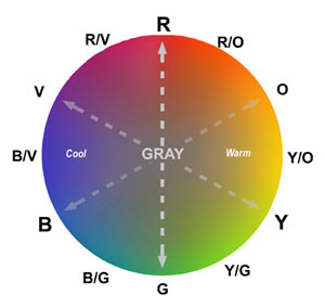 |
Figure 1 The standard color wheel used by most artists demonstrates interaction and relationships between opaque colors. Complementary colors lie opposite to each other on the wheel. Examples of corresponding complementary colors are Red and Green, Blue and Orange, and Violet and Yellow, as indicated by the dotted lines. The right half or the wheel represents the warmer colors, while the left side represents the cooler colors. |
Every color has a complement, and theoretically, when mixed with an equal portion of that complement, the result is a neutral gray (figure 2). We say theoretically because the relative differences in concentration of paint out of the bottle and its position of the color wheel varies. The distance traveled from one position to another on the color wheel depends on how much of the second color is added. If you continue to add enough of the second color, it is possible to move very close to the added color, but you will never quite touch the other edge, This is due to the remaining original "contaminating" color in the mix. This contaminating color prevents you from getting back to the outer edge of the wheel representing pure color again.
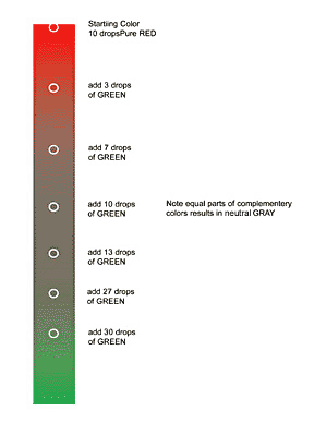 |
Figure 2 Starting at the top with pure red ink, this diagram illustrates the results of adding red's complementary color - green. |
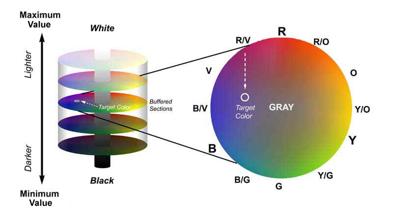
The second part of the system is based on the standard color wheel placed in a cylindrical range of value from light to dark (figure 3). Rather than focus on colors at the outside edge of the color wheel, this theory almost exclusively utilizes the interior of the color wheel. The reason for this is that colors utilized in most representational work are not usually pure in chroma. A tendency of novice artists is to use "out of the bottle" applications of color that are much too pure in saturation to be representative of reality. Most colors within our visual realm tend to have at least some degree of contamination --or gray-- in them. In relationship to the color wheel this "graying" of color can be represented by the interior of the color wheel. Theoretically, complementary colors such as red and green mixed equally, will result in a neutral gray. This gray would be represented by the midpoint or the center of the color wheel, which is halfway between all complementary colors.
 |
One last-ditch effort to combat color shift would be to overspray the area with white and then with orange to cancel out the blue cast. I don’t recommend this as usual approach, but it is feasible.
All material on this page is copyrighted and may not be published, distributed, or reproduced in whole or in part without written consent from Mr. Blair.